The Hidden Psychology of Color in Retail Environments
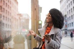
When walking into a retail store, have you ever felt drawn to a certain display or product? Have you ever noticed that some stores make you feel more relaxed while others make you want to buy everything in sight? The answer might be simpler than you think – it could all be down to the colors used in the retail environment. As humans, we have a strong psychological connection to colors, and retailers have caught onto this, using color as a powerful tool to influence our emotions and behaviors. In this article, we’ll dive into the hidden psychology of color in retail environments and how it can impact our shopping experience.
The Importance of Color
Whether we realize it or not, every day we are surrounded by colors that evoke certain emotions and feelings. This happens because colors have a powerful effect on our subconscious. In fact, studies have shown that up to 90% of our initial impressions of a product or environment are based on color alone. With this in mind, it’s no surprise that retailers carefully plan and strategize their use of color to create a desired shopping experience for their customers.
The Impact of Different Colors
Let’s take a closer look at how different colors can affect our emotions and behaviors in a retail environment.
Red
Red is often associated with passion, excitement, and urgency. It grabs our attention and makes us feel stimulated, which is why it’s commonly used in sale and clearance signs. However, red can also be overwhelming if used in excess, so retailers must use it sparingly and strategically.
Yellow
Yellow is known as the color of happiness and optimism. It can evoke feelings of warmth, energy, and friendliness, making it a popular choice in retail environments. In fact, many fast-food chains use yellow in their branding and décor to create a sense of speed and efficiency.
Blue
Blue is often associated with trust, security, and reliability. It has a calming effect and is commonly used in retail spaces to create a sense of stability and confidence. Many banks, insurance companies, and other financial institutions use blue in their branding to convey a sense of trustworthiness.
Green
Green is the color of nature, balance, and harmony. It has a soothing effect and is often used in retail spaces that promote health, wellness, and relaxation. Many grocery stores and health food stores use green in their branding and décor to promote a sense of freshness and naturalness.
Purple
Purple is often associated with luxury, creativity, and spirituality. It has a powerful and mysterious aura that can evoke feelings of sophistication and grandeur. Many high-end retailers, such as jewelry or perfume stores, use purple to create a sense of opulence and exclusivity.
Black
Black is often associated with power, elegance, and sophistication. It has a sense of authority and can make products appear more luxurious and high-end. However, too much black can also create a heavy and uninviting atmosphere, so retailers must use it thoughtfully.
Combining Colors for Maximum Impact
While individual colors can have a significant impact on our emotions, they can also have different meanings when combined. For example, a combination of red and yellow can evoke feelings of energy, while a combination of blue and green can evoke feelings of security and relaxation. Retailers often use a combination of colors to create the perfect shopping environment for their products and target audience.
Conclusion
When it comes to retail environments, color is an essential tool for creating a specific atmosphere and influencing customer behavior. Whether it’s aiming for a sense of urgency, trust, or luxury, retailers carefully choose and strategize their use of color to appeal to their target audience. So, the next time you walk into a retail store, pay attention to the colors around you – they may just be influencing your shopping experience more than you realize.